PRODUCT AS PROTAGONIST: The Marianne Story
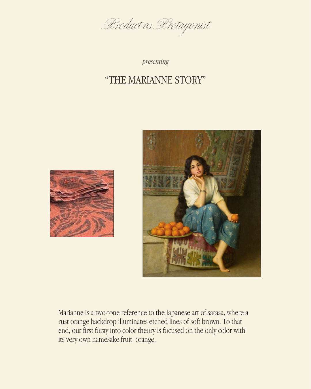
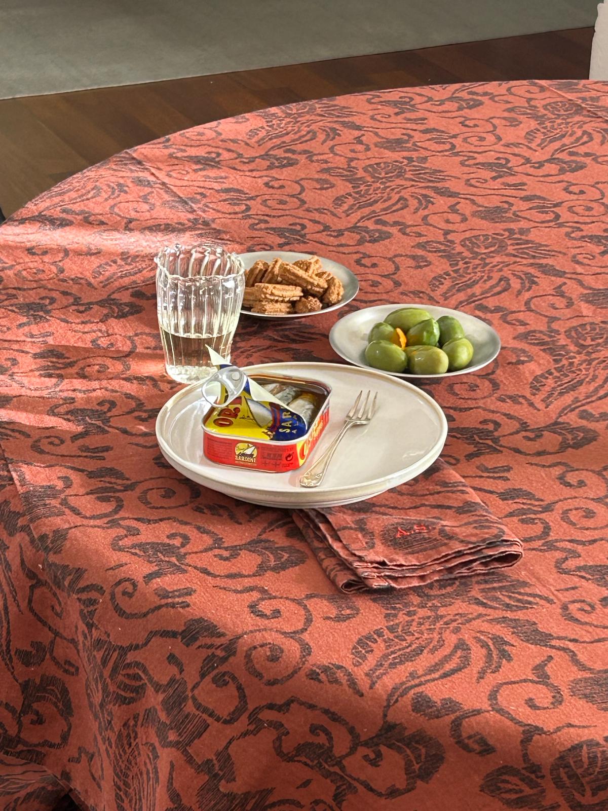
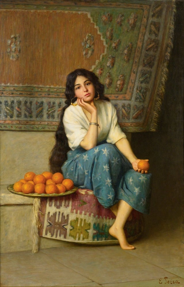
Marianne is a two-tone reference to the Japanese art of sarasa, where a rust orange backdrop illuminates etched lines of soft brown. To that end, our first foray into color theory is focused on the only color with its very own namesake fruit: orange.
Of course, the history of orange extends well beyond its connection to produce. Orange has long held significance in the realms of culture, religion, and mythology, functioning as something of a shorthand for both spirituality and warmth.
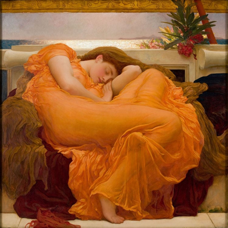
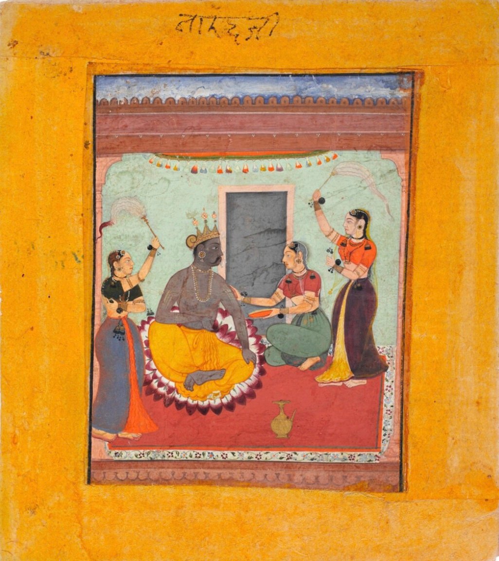
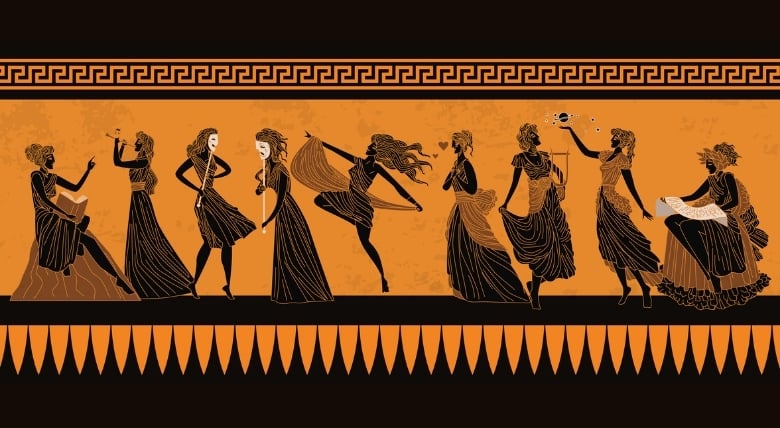
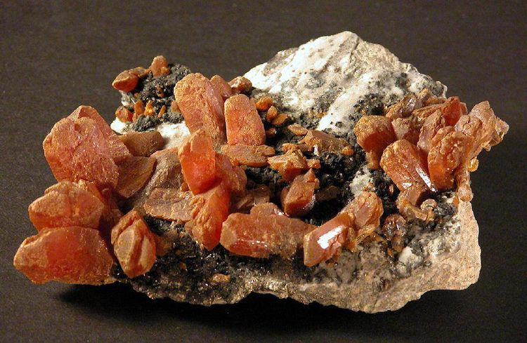
In ancient Greece, orange was akin to a life-force: associated with fruitfulness and vitality, the color became attached to the muses and gods, specifically Bacchus. Toxic minerals like realgar and orpiment were used to achieve orange tones in artwork. As well, orange’s golden hue led some alchemists to believe that it contained the secret to fashioning gold.
Meanwhile, saffron – that is, yellow-orange – is a sacred color in Hinduism, so much so that it became a color of “national importance” in early 20th century India. Saffron remains the most expensive spice in the world; at different points in history, it has been worth more than its weight in gold.
While Marianne may appear to be a simple print, in truth it contains a rich history of vibrant color. Take a closer look at Marianne tablecloths, napkins, and placemats here.